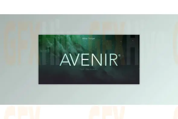
The Avenir Font Family is a celebrated geometric sans serif typeface crafted by the legendary type designer Adrian Frutiger. First introduced as a contemporary reinterpretation of early 20th-century geometric fonts, Avenir combines the clean, structured qualities of classic design with subtle humanist touches, resulting in a font that feels both timeless and modern.
Avenir’s name, meaning "future" in French, reflects its design philosophy—forward-thinking, adaptable, and visually compelling. Unlike rigid geometric fonts, Avenir introduces slight curvature and soft edges, making it more readable and emotionally engaging. This balance between geometry and warmth sets it apart, making it an excellent choice for everything from digital interfaces and mobile apps to print publications and corporate branding.
The font family includes 12 OpenType fonts ranging from Light to Heavy, including Book, Roman, and their corresponding obliques. While Light and Book may appear visually similar, the subtle difference in weight is intentional—Book is optimized for body text readability, whereas Light excels in captions and small-size typography.
Avenir has been widely adopted across various industries. It’s used for signage at the Dallas Fort Worth International Airport and the Hong Kong International Airport—proving its clarity and professionalism at scale. The city of Amsterdam also selected Avenir as its official corporate typeface in 2003, underlining its authority and versatility in civic identity.
Whether used for titles, headlines, user interfaces, editorial content, or brand systems, Avenir’s minimalist elegance and refined craftsmanship make it a staple for designers who value both style and function.
Subscribe to access unlimited downloads of themes, videos, graphics, plugins, and more premium assets for your creative needs.
Published:
Aug 21, 2025 12:01 PM
Category:
Tags: