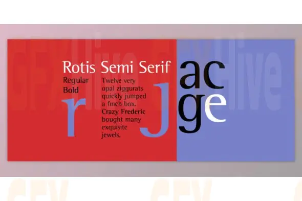
The Rotis Semi Serif Font Family is a visionary typeface crafted by renowned German designer Otl Aicher in 1989 for Agfa. As part of the broader Rotis Superfamily, this font collection masterfully blends design elements from sans serif, serif, semi serif, and semi sans styles, offering both stylistic harmony and typographic versatility.
This particular set includes 12 OpenType (OTF) fonts, derived from a family that originally launched with 17 total weights including italics. The Semi Serif variant is especially distinctive—blending the clean lines of sans serif with the subtle, implied serifs of traditional serif fonts. It maintains excellent legibility while introducing artistic flair and a humanistic tone.
What sets Rotis apart is its pan-European character set, making it an excellent choice for multinational and multilingual communication. The typeface showcases elegant design features such as its iconic cap C, and lowercase c and e, which are known for their hooked tops and underslung curves—hallmarks of European visual identity.
Originally met with mixed reactions due to its unconventional design, Rotis Semi Serif has grown into a widely respected typographic staple. It is now used across a range of professional formats including corporate branding, business reports, editorial layouts, advertisements, annual reports, signage, and more.
Named after the village of Rotis in southern Germany where Aicher lived, this font family has become a standard in European typography. Its clean, rational, and aesthetically unique design makes it a go-to choice for designers seeking a balance between clarity and character.
Subscribe to access unlimited downloads of themes, videos, graphics, plugins, and more premium assets for your creative needs.
Published:
Oct 07, 2025 10:46 AM
Category: